• Facebook
  • Instagram
  • Pinterest
  • Snapchat
  • Twitter
  • YouTube
  • Skip to primary navigation
  • Skip to main content
  • Skip to primary sidebar

MsMarmiteLover

  • Food
    • Recipes
    • Vegetarian
    • Vegan
  • Travel
    • France
    • Italy
    • Spain
    • UK
  • Wine
  • Gardens
  • Supperclubs/Events
  • About
    • Published Articles
    • Books
  • Shop
    • Cart

Branding The Underground Restaurant

September 22, 2009 33 Comments Filed Under: Uncategorized


I’ve decided to ‘brand’ myself. I sourced little vintage French pinnies for front of house. The bibs are pinned up with safety pins (nod to my punk days), garnished with skulls and little silver ‘charms’ of food that I have found on my travels.

I also asked young designer Rachael Rodgers to come up with designs for my food range ‘The Underground Restaurant’. I’m going to sell salsa, guacamole, pickled lemons and other products. The notes I gave to her were “I want it punky, edgy, pirate, foody with feminine, French, gingham and vintage”. In short, include influences from my personal history, travels, and the illicit, clandestine, guerilla nature of The Underground Restaurant.

Here are some of her sketches. What do you think?

I like this one, it’s like all my blue and white china.

This would be good for the labels on my jars.


Recent posts

Dutch Baby apple and cheese pancake

September 17, 2023

La bomba paella rice

August 25, 2023

No-churn ice cream recipes

August 7, 2023

Previous Post: « Party
Next Post: Parent's evening »

Reader Interactions

Comments

  1. Manne

    September 22, 2009 at 2:23 pm

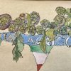
    I love the top one on the checkered background, but the skull is a bit overdone.

    Drop some of the detail on the skull, emphasize the chef hat I would say!

    // Manne

    Reply
  2. theundergroundrestaurant

    September 22, 2009 at 2:27 pm

    Thanks for your feedback Manne.
    I like some of the detail because it's like my vintage crockery…also quite Mexican.

    Reply
  3. Krista

    September 22, 2009 at 2:31 pm

    i dig #4 but the font is a bit hard to read…

    Reply
  4. theundergroundrestaurant

    September 22, 2009 at 2:32 pm

    I agree Krista, that's why I asked for a more French vintage handwriting font like below.
    Thanks!

    Reply
  5. B

    September 22, 2009 at 2:37 pm

    I like the 2nd one, but the first one is good too! i think vintage/punk are easy to pair, but french/vintage/punk can get a teeny bit more difficult. love the safety pin ideas though, so cute!

    Reply
  6. theundergroundrestaurant

    September 22, 2009 at 2:40 pm

    The safety pins are cute aren't they? I want a little bit of diamante to put on them too…

    Reply
  7. Graphic Foodie

    September 22, 2009 at 3:15 pm

    Mmmm. Not sure if I'm honest.

    If you were set on the skull route I would soften it a bit like: http://www.istockphoto.com/stock-illustration-8406514-valentines-skull.php

    or these remind me of Mexican day of the dead images which is eddgy without being too harsh: http://www.iwantyourskull.com/wp-content/uploads/2007/10/birdsjpeg.jpg

    Kitchen objects could be incorporated and I like the knife and fork crossbones.

    Also, something that is easily replicated as one colour (no gradients) would keep printing costs (and problems) down for labels etc…as is something that can be resized without loss of too much detail for smaller items. The gingham could be actual fabric on the jar lids to bring in colour. The one colour would look good with the food product too and not er, jar, too much.

    The type needs to be tight, especially as you may wish to use it independently from the skull imagery in future.

    God sorry, blah blah, I really could go on for hours about this!

    Reply
  8. theundergroundrestaurant

    September 22, 2009 at 3:32 pm

    Fascinating. Do feel free to go on for hours…graphicfoodie. I should have known you'd be the one to know about this stuff
    I wanted the classic French handwriting, like on the Bonne Maman jars…that's easier to read than this font…

    Reply
  9. Anonymous

    September 22, 2009 at 3:40 pm

    This may sound a bit off the wall, but I don't like #1 and 2 because of the mouth – it looks like the skull's mouth has been stitched shut. And that is definitely not you! Writing very hard to read on #3, but 4 and 5 are winners in my book. I like the font better on 5.

    Reply
  10. Graphic Foodie

    September 22, 2009 at 3:48 pm

    Ha! Yeah, can you tell I work for a branding consultancy!

    The Bonne maman brand popped in my head actually – just more punk-like in tune with the whole Underground restaurant movement. Maybe black gingham? The Bonne Maman style of font could work really well.

    I dunno. Branding is just about getting the flavour right of what you are representing and not making it into something it isn't so it communicates what it is to someone who may not know exactly what the company/product is.

    Great quality produce, a tinge of illicit and the personality of the Underground Restaurant is where I would take it. Different to own produce which tends to go down the wholesome, kraft paper and organic route so it will have stand out.

    If I think about this any longer my head will explode with ideas. It's a great project.

    Reply
  11. Andy Lynes

    September 22, 2009 at 4:38 pm

    Joe Warwick's beaten you to it with the skull and crossed cutlery thing http://www.galleyslavery.com/

    Reply
  12. SaltShaker

    September 22, 2009 at 6:01 pm

    It's awfully similar to the logo of The Ghetto Gourmet, one of the original underground restaurants…

    http://www.theghet.com/

    Reply
  13. theundergroundrestaurant

    September 22, 2009 at 6:14 pm

    It seems like it's a symbol of all that is a tad illegal. What she has designed is quite different in detail though…?
    It's more feminine…

    Reply
  14. Scarlett the Heavenly Healer

    September 22, 2009 at 6:27 pm

    I like the top one but like the idea of black gingham. And I agree the toque should be larger. I wouldn't worry too much about the crossed cutlery having been done before, it's an obvious thing to do in a pirate-ish (or pirate-esque maybe?) themed food project, just important that it's done with your own style, which yours is. Great that you are doing this. How exciting!

    The safety pins are SO SO fab!
    X

    Reply
  15. Lennie Nash

    September 22, 2009 at 9:06 pm

    Love the idea, and wish you all success with it. Got to say, I don't like the skulls, but I love the last sketch.

    So you going to be pickling lemons then?

    All the best,

    Lennie

    Reply
  16. Niamh

    September 22, 2009 at 10:10 pm

    Oh, I love this idea! And my favourite image is the one with the red gingham. Very cute and raw.

    Reply
  17. Ben Emlyn-Jones

    September 23, 2009 at 6:31 am

    I love that skull with the crossed cutlery. Very imaginative, especially with the chef's hat. But Manne's right; the skull would look best a bit simpler. Hey, will you fly that flag outside your house on restaurant nights? 🙂

    Reply
  18. theundergroundrestaurant

    September 23, 2009 at 7:34 am

    I've just added the last drawing, the file was corrupted yesterday. This is my favourite drawing.
    I agree the tocque needs to be bigger.
    Maybe the skulls aren't a good idea and I should have my face drawn Paul Newman stylee, instead.
    I think the skull and knife and fork thing have been used quite extensively. I do think that this design departs from the ghet one…it's a general symbol for the movement. I'll ask the ghet what they think?

    I'd love a flag! I even have a wrought iron post to hand it from, which I bought a few years ago from a French brocante. I just need to get someone to put it up.
    Black gingham would be interesting.
    My kitchen uses alot of blue and white gingham.I thought I could use different coloured ginghams for different sauces…
    Thanks for everybody's comments, keep em coming.

    Reply
  19. Mat Follas

    September 23, 2009 at 7:52 am

    Like most … styling is great … but skulls and food … I don't get it … go with punk/frenck/lace/shock colours … much more you (as far as I know you) …
    Mat x

    Reply
  20. Kavey

    September 23, 2009 at 7:55 am

    Overall I like the first one best, with it's pretty blue and white crockery theme softening the pirate skull theme. I also really like the circle of the plate rim behind the knife and form behind the skull.

    But I don't like the skull itself in that one, I vastly prefer the one in 4. Though I can't decide whether a side-on skull like that would work in front of the plate or not.

    Perhaps your artist could re-work number 1 trying out different styles AND different orientations of skulls.

    Personally, I'm not so fussed about the mini chef's hat on top of the skull but can take or leave it so if you're really keen would leave it in.

    Whilst I like your thoughts on gingham I'm not sure it doesn't make it all a bit too cluttered. Certainly the second design with smaller plate, product name banner and red/white gingham doesn't work at all for me.

    But maybe keeping the plate as large as it is in number one nad putting a folded gingham napkin beneath it, tucked in under the plate a touch, at a diagonal angle to the lower right, to offset the chef's hat, might work? Don't know, would need to see it done to decide.

    Reply
  21. green drawers

    September 23, 2009 at 9:10 am

    for my two penneth black gingham works for me – it's also what the Balinese use to indicate bad times for certain deities. They will wrap certain statues in black gingham to indicate it's their 'time of month' so to speak. Good match for you I think! Like everyone else I feel the skull is too dominant and too complicated. What about introducing it as decoration on the blue china / engraving on the cutlery? More underground perhaps? Anyway it seems you have access to great designers already – use them and abuse them – they love it!

    Reply
  22. The Curious Cat

    September 23, 2009 at 10:05 am

    Pretty funky designs and colours, though as a marketeer I'd be wary of the skull in a skull a cross bones pose. That is the symbol for poison and you certainly don't want to give the message that your food is that! It is cool but some people will inevitably read that message… But hey, that is just my humble opinion…I love what you do so please don't take this as any criticism…just trying to be helpful! I love the idea that you are designing a brand and that you will be doing your own food! xxx

    Reply
  23. The Curious Cat

    September 23, 2009 at 10:11 am

    PS It is really actually quite an interesting concept the more I think of it – the skull with the food -that you have gone for…I studied Classics for my degree and we did a module on the importance of death and food in the context of Roman dining. Romans used to have skulls and mini sarcophogai at their dinner tables and great terrifying statues in their dinner halls because they believed that it was a very important reminder and helped one to appreciate their life and give thanks all the more as they ate the food that would inevitably prolong their lives…there is so much material on this subject that if you fancied, you could explore further for ideas and inspiration…anyway just a thought…

    Reply
  24. Graphic Foodie

    September 23, 2009 at 12:02 pm

    "designers…use them and abuse them – they love it!"

    Yeah, we find it a real hoot Green Drawers to be though of in such derogatory fashion. Muppet.

    Love this open forum though Ms Marmite. One design agency is using public voice to design the new London brand. Great idea to get feedback at the early stages.

    Reply
  25. James

    September 23, 2009 at 2:22 pm

    I'd go for the 4th one. Looks the least like the one that says you're going to die if you eat this 🙂

    Reply
  26. theundergroundrestaurant

    September 23, 2009 at 3:01 pm

    Love the idea of a gingham napkin Kavey brilliant way of incorporating it.
    Mat: yes a few people have said that…skull means poison…danger. But I guess it's also subverting that somehow. Like running the Union Jack upside down.
    Green Drawers…putting the skull as part of the plate pattern design, a sort of punk version of blue willow. Like it!
    cc: Very interesting your information on the memento mori theme
    Graphic Foodie: Green drawers is a really lovely woman, I'm sure she was joking…thanks for enjoying this open forum. It's been so informative and interesting for me; articulating ideas that I sort of knew I was thinking but couldn't quite put my finger on.
    James: 🙂

    Reply
  27. Josordoni

    September 23, 2009 at 3:16 pm

    I love the last banner, and I LOVE the safety pin with charms… could you use the safety pin somehow instead of the skull?

    I am not sure that the skull is good subliminally, as others said, it is a bit "poison" or at the very least not necessarily pleasant…but maybe that edge of danger could also be turned into a definite USP? Underground Restaurant as Sex Pistol kind of thing….

    Reply
  28. TheFastestIndian

    September 24, 2009 at 9:46 am

    Will throw in my comment, although you seem to have lots already!
    I really like the gingham background, but am not very keen on skull/bones imagery. I wonder if it would be possible to incorporate the underground/punk aesthetic in another way?
    I'd also maybe think about limiting the colour palette so it's not too multi-coloured swapshop.
    Definitely worth taking lots of time until you get somthing that you're totally happy with!

    Reply
  29. Julius Beezer

    September 24, 2009 at 10:35 am

    Skull = death, poison

    Will put people off. Perhaps if you want to symbolise the pirate nature of the enterprise you might use a crossed scimitar and fork?

    Reply
  30. Josordoni

    September 24, 2009 at 11:03 am

    Would a pirate's hat over knife and fork work?

    Reply
  31. green drawers

    September 29, 2009 at 1:42 pm

    thank you for defending my honour Ms M. Can't quite see myself as a muppet – can you? Perhaps I could be Animal? Or maybe one of the old men on the balcony, in drag… Anyway, cannot wait to see the final images, and especially looking forward to the food. xx

    Reply
  32. Serafina

    October 1, 2009 at 10:08 am

    Hey mis marmitelover. Your new food range sounds yummy. Do you know the Kitchen TAble cafe in Mill LAne NW6 – close to you I think? I'm sure they would love to flog some of your wares as they a reel foodies and enterpprising folks too. Pop in and see Jennie or Tom. Good luck wiv it.
    Ps I like to skulls, they remind us that life is short and so we should enjoy it (including good food) while we can
    Serafina

    Reply
  33. Canal Explorer

    November 3, 2009 at 12:26 am

    My favourite, and the one that I think best captures the vibe of your restaurant, is the blue and white onr. However I don't really like the skulls, as for me it says "death", and being a very vegetarian friendly restaurant (and chef, and product) you're doing yourself a bit of a dis-service. Liked the suggestion somebody made of a pirate knife. Otherwise, why not steer away from pirates – in practice piracy is rather unpleasant, unlike your products!

    X

    Reply

Leave a Reply Cancel reply

Your email address will not be published. Required fields are marked *

Recipe Rating


Primary Sidebar

MsMarmiteLover aka Kerstin Rodgers.

Chef, photographer, author, journalist, blogger. Pioneer of the supperclub movement.

This is my food and travel blog, with recipes, reviews and travel stories. I also stray into politics, feminism, gardening.

Subscribe to my mailing list

msmarmitelover

Kerstin Rodgers/MsMarmiteLover
Apple rose blossom tarts with rose jam. Rose Appl Apple rose blossom tarts with rose jam.  Rose Apple Blossom Tarts

Serves 8

Equipment: 
Microwave
Cupcake or muffin tin

I use a red-skinned apple to make these, to get a hint of blush at the edges of the ‘petals’.

Ingredients:
4 Pink Lady or Royal Gala apples, cored, cut into quarters, sliced thinly into half moons
1 lemon, squeezed
1 pack all butter readymade puff pastry 320g, on a roll, cut into 8 strips about 6 cms long
100g of melted butter
1/2 jar of rose jam
1 or 2 tbsp cinnamon or cardamom, ground 
Pinch maldon salt
2 or 3 tbsp icing sugar

Instructions

Prepare a bowl of acidulated water (cold water with lemon juice) to prevent browning.
Core the apples, and cut them in quarters. Slice thinly into half-moons (a mandolin is useful for this). 
Put them into a large bowl of cold water with the lemon.
Microwave the bowl of sliced apples for 5 minutes until soft enough to bend slightly but not cook them.
Preheat the oven to 180ºC.
Roll out the puff pastry. Divide into 8 sections by cutting the roll into quarters then halving each quarter. You will end up with 8 approximately 6cm strips.
Brush the strip with melted butter then paint with a layer of rose jam. You can then dust with either ground cinnamon or cardamom.
Lay the apple slices along the top of the pastry strip, overlapping them. Fold up the bottom half of the pastry strip to make an pleat with the skin side of the apple half moon poking over the top.
Roll up the folded pastry strips until they look like a rose made of apple at the top
Place ‘rose’ side up, in a buttered cupcake tin
Repeat until all are done and bake for 20 -30 minutes.
Using a tea strainer or small sieve, sprinkle with icing sugar.
A lovely vegetarian recipe from @lulugargari - a g A lovely vegetarian recipe from @lulugargari - a green bean and basil pesto with Italian lemon 🍋 pasta. Fresh, light. This was at an Italian cooking class/demo @eatalylondon hosted by @ilovefruitandvegfromeuropecouk @flickflock #london#italy🇮🇹
Digital chefs came from Italy yesterday to teach h Digital chefs came from Italy yesterday to teach how to make pumpkin, chilli, taleggio fondue Paccheri pasta- warming and filling for autumn days. Thanks to @ilovefruitandvegfromeuropecouk @flickflock @eatalylondon @danielerossichef @lulugargari for the event. We then got to go shopping in Italy with a £50 voucher. I spent it on mostardi di frutta, burratta, carciofi, cheeses,. My sis in law @bro0907 spent it on two bottles of wine. 😂 #italianfood #italianingredients #cookingclass #campaniafood
Inspired by @kathybrownstev’s book on edible flo Inspired by @kathybrownstev’s book on edible flowers I did an edible flower supper club featured in my first book ‘supper club’ This weekend I briefly visited her garden. Decades of work and creativity went into creating this English oasis. It’s an hour and a half out of london near Bedford. It closes at the end of September: open Tuesdays and this coming weekend. It was odd to go on holiday so near to where I live! We had a beautiful Airbnb in Pavenham. The countryside starts nearer to home than I thought. #uk #england #gardens
Visited The speciality fine food fair today for th Visited The speciality fine food fair today for the first time. So many tastings! Great to see new products. Particularly impressed by @lamiriharissa which is smoked and delicious run by Jo Lamiri’s children and @quirkymonkeycoffee which is mushroom infused coffee and hot chocolate run by an autistic guy Darwin setting up his own business. Good for him. #foodexplorer
Bones and all. Just made tomato sauce pasta from m Bones and all. Just made tomato sauce pasta from my home made sun dried tomato concentrate made @tenutacammarana in Sicily last summer. It’s the taste of sunshine. Plus my English home-grown tomatoes. #Tomatoes 🍅 🍅 🍅 #dinner #babyledweaning
I’ve made a South African/ Botswana dish that is I’ve made a South African/ Botswana dish that is creamy samp with chakalaka. Samp is corn like hominy or pozole a native Indian or Mexican food. It’s strange that it’s a staple food in Africa. Corn is a new world food I think. Samp itself is quite bland, often eaten with beans. Chakalaka is delicious with peppers, Piri piri seasoning, ginger garlic onions tomatoes and carrots and baked beans.
Samp from Botswana. It’s husked corn and makes a Samp from Botswana. It’s husked corn and makes a porridge like carb- creamy samp. I’m rinsing, soaking and cooking today and will combine it with chakalaka tomorrow. #southafrica #botswana #samp #newworldoldworld
Did my living room floor with @woca_denmark_uk_ire Did my living room floor with @woca_denmark_uk_ireland natural floor soap yesterday which smells lovely. But high traffic areas need rewarding. This is a Scandinavian technique- regularly waxing pale wood floors. I did this floor during the first year of lockdown. I prefer waxed floors to varnished. #interiors #woodfloors
Handbag condiments: @tajinuk , salt @maldonsalt do Handbag condiments: @tajinuk , salt @maldonsalt do a great little handbag tin, soy sauce bottles, and of course a handbag @marmite . I’ve also been known to carry a handbag @wd40uk and a handbag @cremedecassis to make poor white wine drinkable. What do you carry in your bag? Are you like Beyoncé and carry hot sauce in your bag?
Alliums in a purple pot. Note to self: plant more Alliums in a purple pot. Note to self: plant more bobble headed alliums. Love the colour and shape. This is in a neighbours garden who I met on Saturday while working in the front garden. Traditionally the British have front gardens but now they are turned into driveways and building are developed into flats. Only very rich people in london can afford houses. But the front is very important for the community- it’s how you meet your neighbours. On Saturday I visited 2 different sets of neighbours gardens- the first time since I moved to this street 23 years ago. Our front garden is communal and has been an unloved space- I’m trying to change that. Tonight I cleaned all the wheely bins. A yucky job but otherwise they smell so bad in summer. I was thinking about all the terrible dirty jobs that someone has to do- clearing up after a road accident, or sorting out sewers, or unblocking toilets. The stuff that nobody likes to think about. #frontgardens #neighbours #londoners
What I’ve been up to: awning from @victorianawni What I’ve been up to: awning from @victorianawnings which has transformed our al fresco eating possibilities. Also been working on the front garden of our building using talented work men I found on fb marketplace: railings by @lincsecproducts ( the gates were bought by me some years ago and I’ve scraped off the rust and repainted), the arch, which took me 3 years to find on fb marketplace for the right price and size. The wisteria which will grow over the arch planted by @christina_erskine ( I’ve always wanted a wisteria and they apparently add to the value of your house), the Swiss style bike/buggy shed. Needs to be painted dark green to match the walls. My friend Jim repaired the walls, the coping, and laid the  concrete plinth. Now need to find coping for the pillars or perhaps urns for more plants. 47cm2. #interiors #exteriordesign #gates #railings #bikeshed #awning #design
Made a vegetarian paella with La bomba rice from @ Made a vegetarian paella with La bomba rice from @brindisaspanishfoods I used red and green peppers, saffron, sherry, Nyora peppers, smoked almonds and green olives #vegetarian #vegetariansummer #paella
Quick snap of my bedroom chimney wall with the @sa Quick snap of my bedroom chimney wall with the @sanderson1860 wallpaper - finally done. Never wallpapered before. By the way I’m totally open to interiors collaborations email me: marmitelover@mac.com #interiordesign #wallpaper #london
I was sent some incredible olive oil from Sicily b I was sent some incredible olive oil from Sicily by fattoriabaronemocciarolidestri Terrediequila wonderful quality. Intense new grassy flavours. #oliveoil #sicily
Cooking powders or flavour bombs: two of my favour Cooking powders or flavour bombs: two of my favourite are ‘chaat’ which you can buy in Indian shops- here I’ve sprinkled yoghurt with lime/achaar chaat and decorated with day lily petals. My other favourite culinary powder is @tajinuk which gives instant mexicanness to any dish. #tajin #chaat
Me and my beautiful granddaughter Ophelia. I look Me and my beautiful granddaughter Ophelia. I look a mess ( really need to dye hair but it’s sooo expensive) but I don’t care because my heart just bursts when I cuddle this little being who has been in my life for 8 months. Babies are a blessing. #granfluencer pic: @clairebelljar
Made arepas last week with masarepa, a precooked m Made arepas last week with masarepa, a precooked maize meal, topped with Wensleydale cheese which isn’t too dissimilar to a fresh Latin American cheese. I also added fresh corn kernels for texture. #colombia #venezuela #arepas #vegetarian
Quinoa salad cooked in a mushroom stock cube solut Quinoa salad cooked in a mushroom stock cube solution with hazelnuts & preserved lemons, home grown curly parsley. I’m not cooking most of my grains in a rice steamer. Turn out fluffy & perfect every time. #quinoa #grainbowl #summerfood
I took this photo of Jane Birkin when she performe I took this photo of Jane Birkin when she performed at @theroundhouse in 2008. Shabby chic with a sweet voice. #RIP #janebirkin #concert #london #rockphotographer
Load More... Follow on Instagram

Archives

Copyright © 2023 msmarmitelover