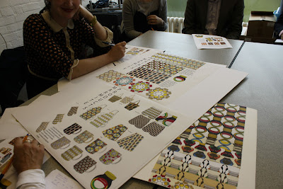
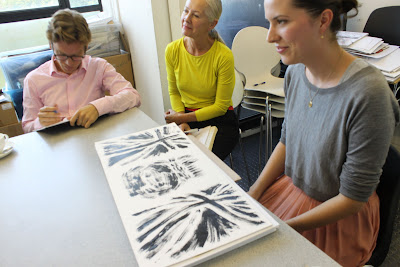
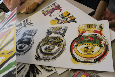
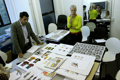
We were looking for something to replace the current line, based on Andy Warhol’s style, and we sat all afternoon while a dozen or so talented students showed us their ideas. The winner would see their design produced on mugs, plates, etc.
Here is the brief:
The panel consisted of:
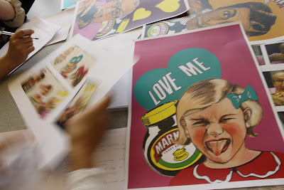
The Marmite brand lady talked about Marmite: it only has a shocking 9% ‘penetration’ (the percentage of shoppers that buy it). Few ‘pre-families’ buy it. What/who are ‘pre-families’? People who haven’t settled down and had kids yet. People have Marmite in the family home, but when they leave to go to university, they don’t continue to buy it. But they start buying it again when they have kids. We need to encourage our young people to buy Marmite!
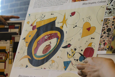
It was difficult to pick a winner. Every student was stunningly gifted but we had to consider if the designs would translate to mugs, tea towels, plates, oven gloves. We also had to think whether the designs would have longevity; the range is planned to come out at the end of 2012.
For instance, I love the shabby chic retro look, but part of the appeal may be based on the fact that we are living in times of economic uncertainty. We are not looking to the future, but the past. Assuming we will be buried in double dip austerity during 2012, will we be desperate for a bright cheery futurist vision by then?
“What did people buy after the last Great Depression?” I asked finally.
“Well we went straight into World War II”grimaced Corinne “but after that it was the New Look and the fifties”. Ah yes, the kodachrome colour palette of the nuclear pop star Elvis….
It’ll be interesting to see what happens next in the zeitgeist as reflected in design.
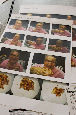
Amelia Mullins accurately pinpointed the humour in the Marmite brand. She did photographic research of ‘haters’ and ‘lovers’, their expressions. This is her grandad loving it.
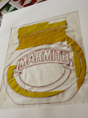
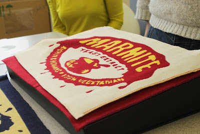
This took weeks to cross-stitch, the student even took it on holiday, but it was left unfinished. I like it that way.
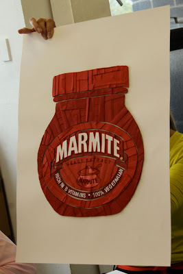
I really loved this embroidered and quilted marmite designs from Alexandra Palmowski but it was felt that it wouldn’t translate onto ceramic.
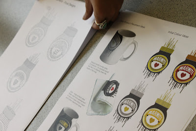
Lily Kamper used her trademark style of graphic lines in her Marmite project. The panel weren’t sure that the lines translated properly….they could look like birthday cake candles. Beautifully drawn though.
Expressionist Marmite from Tiphaine Alston. We loved the paintings but weren’t sure it would work as home ware.
Lichtenstein themed designs from Joanna Burdett in a beautifully presented and executed project. Panellists were a little worried that it was too similar to the Andy Warhol style merchandise.









Cool. Very interesting. Off to make Marmite on Toast.
I am reminded that I once smeared marmite over a beef joint and slow roasted it. Very yummy.
Love this post. All the designs are good, but Joanna and Jessica's were my favorites! Ditsy dots repeated in a design is comforting when faced with double dip recessions… Can't really say why, except it feels retro and familiar.
wow – what a fun thing to do! I'm a massive Marmite fan. can't wait to see the new designs come out next year.
Astounding that only 9% of people buy it. Who'd have thought it? Can't imagine not having a pot in the cupboard!